Notes On Implementation of Gatsblog
I'm gonna talk about the implementation of Gatsblog, which is a blog system implemented with Gatsby.js, in this post. If you missed out previous posts about the overview and design of Gatsblog and don't know the tech stack I'm talking about, you can check the previous posts. Since Gatsblog is my first JavaScript-node-front-end project, I don't ensure the following contents are the best practices.
Identifying Resources
How to identify a post from others?
For there are posts may have the same name, we have to identify a post from
others. Like Jekyll, I chose a URL scheme like /post/YYYY/MM/post-name and
a file name scheme like YYYY-MM-DDThh-mm-ssZ-post-name.md(The time and
timezone is optional). Because the file name scheme may contain time
info ( Thh-mm-ss ) and timezone info ( Z ), soon it was found that you cannot
identify posts which were posted at the same day with the same post name in
this way.
Then I decided to hash the YYYY-MM-DDThh-mm-ssZ part and append the hash
value to the URL scheme. Thus the URL scheme turns out to be:
/post/YYYY/MM/post-name-1a0cand we can identify each post now.
Protects Sensitive Info from Bots
There are always some sensitive info on our site and we only want to give them
to real users but not bots. But plain HTML contents like
mailto:whatever@email.ltd expose your sensitive info to the bots. To prevent
bots from crawling our sensitive info, I designed an ad-hoc progress and
implemented a React component to do the things:
- The blog system firstly encrypts sensitive info when compiling the sources.
- Then the React component decrypts the sensitive info when the component was clicked by a real user.
Implementing this is quite simple, the only trouble here is that Safari prevents
programmatically behavior changes like page redirection against clicking unless
you called event.preventDefault() right after a click event.
Getting Used to CSS Layout Box
When implementing my design, I spotted that CSS layout box is not designed for professional designers.
Someone probably would say: Wow, there are another layout models like flex-box and grid in CSS.
Nope. I didn't mean the box model of CSS is not designed for professional designers, but all the layout models of css are not designed for them.
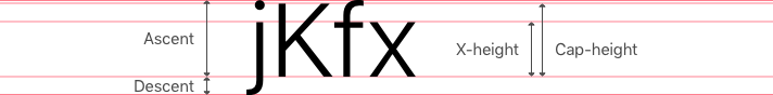
A CSS layout box in whatsoever layout model computes its content size of texts
with line-height. But line-height is not a native creature in designer's
world. A designer is familiar with ascent, descent, x height, height and even
line spacing which are properties related to typography, but it would not be
familiar with line-height.
line-height in CSS sets the amount of space used for lines, such as in text.
This means line-height has nothing to do with the font's attributes. The only
way that you can connect line-height to font is to set it with pure
number (without unit) -- this makes the web browser's renderer to think there is
a ratio between line-height and font-size.
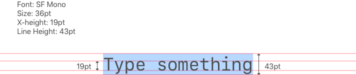
But as we showed in the previous post, a designer may lay things out with attributes of fonts. This makes that the default size of a layout box in CSS may not work as what you expected.
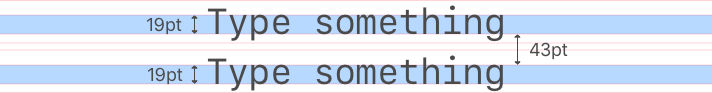
To make a bridge connects CSS layout box and the designer's world, we need to
think in line-height when we setting up margins which instead of font
attributes. Thus I developed a solution: Normalized Layout Box -- to shrink the
layout box's size to the designer purposed one.
Normalized Layout Box
To shrink the layout box's size, we can make use of negative margin.
css
But since block element collapses margins, which happens whenever an
element is next to another but also an element is nested to another, we
finally get 0 top margin if the layout box is the first child and 0
bottom margin if the layout box is the last child. To make negative margin
to work for the case of being first and last child, we have to use a flex
box element to wrap the block elements.
css
html
Testing
This project is not a well tested project. Because testing in JavaScript is very tedious or say, boring. Since JavaScript is a dynamic language, we don't need to build an explicit scheme for a data type before using it. This leads the correctness of code seriously relies on testing. Thus there remained tons of works if we were pursing a more correct program.
You might come up with "snapshot" -- which is a great feature in Jest. But some issues are caused by mismatched types, or other mistakes which can be eliminated by type checking that may be a part of the language.
Moreover, how to ensure a manually grabbed snapshot is correct?
I need a type system in JavaScript. Yes, I mean I need TypeScript and I would transfer the development language from JavaScript to TypeScript if I continued to upgrade this blog project.